THE ARCHITECT'S PERSPECTIVE
By Laurent Dequick
Laurent Dequick, a professional architect and photographer, guides us in deciphering plays of light, fascinating perspectives, hidden lines of construction, and unusual details, all in service to the aestheticism of a structure.
EVERY MONUMENT HAS ITS OWN QUIRKY ANECDOTE
A UNIQUE VISION OF ILLUSTRIOUS MONUMENTS, FROM A FAN OF ARCHITECTURE.
Laurent Dequick also shares his perspective with the aim of providing a new, more modern reading of shared heritage. Historical sources, retro-engineering, graphic tablet, or Photoshop… he combines the respect of heritage with modernity in this original project. Photography enters a new dimension.
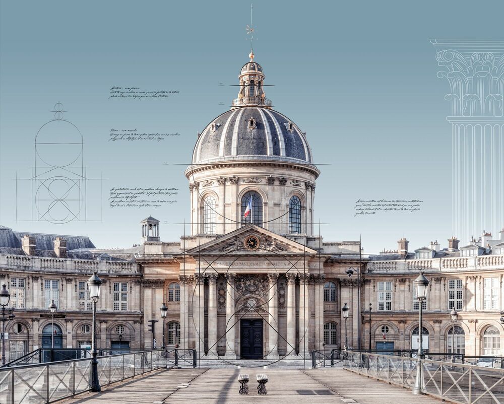
Académie, Paris
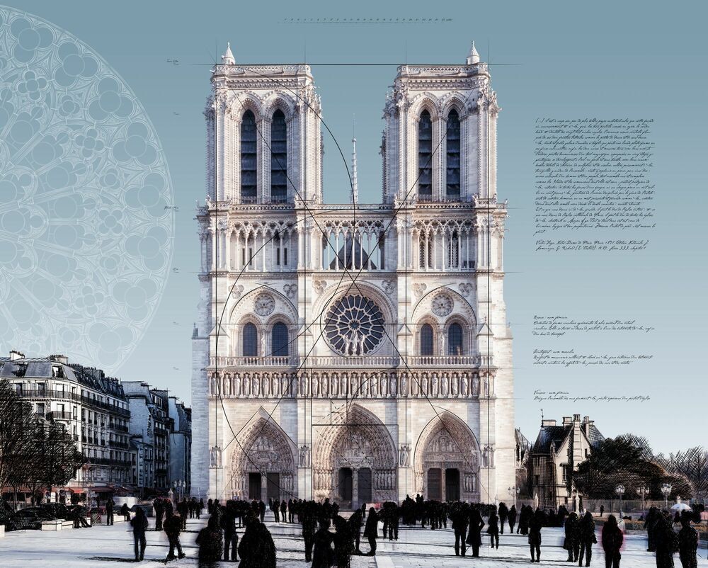
Notre dame, Paris
Since its creation in 1635, the unique purpose of the Académie française has been to oversee French language usage and perfect it. Written under the surveillance of the forty Immortals (members elected for life), the dictionary of the Académie française has been a natural authority for centuries.
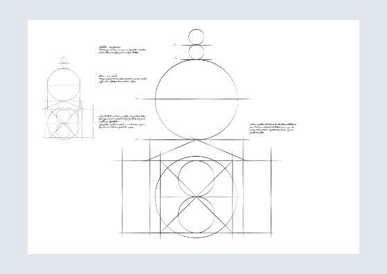
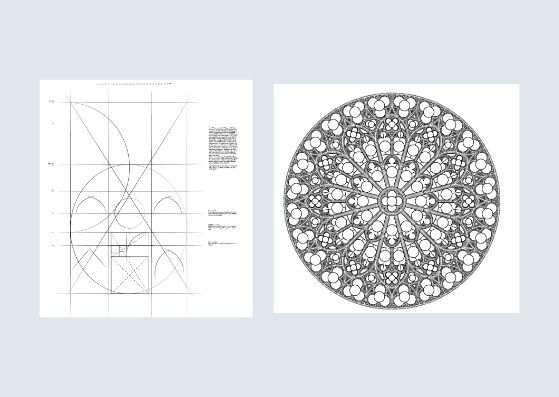
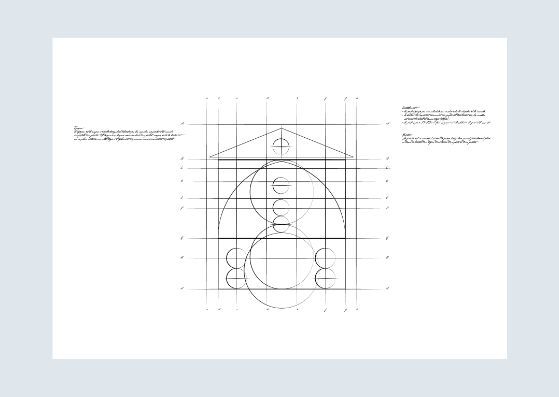
The cathedral was built according to the proportions of the golden ratio. If you divide the height of the façade by its width, you roughly obtain the golden ratio. You can also find golden rectangles in the doorframes, except for the central doorway and the second floor, between the main stained-glass window and the two towers.
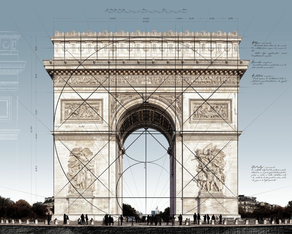
Arc du Triomphe, Paris
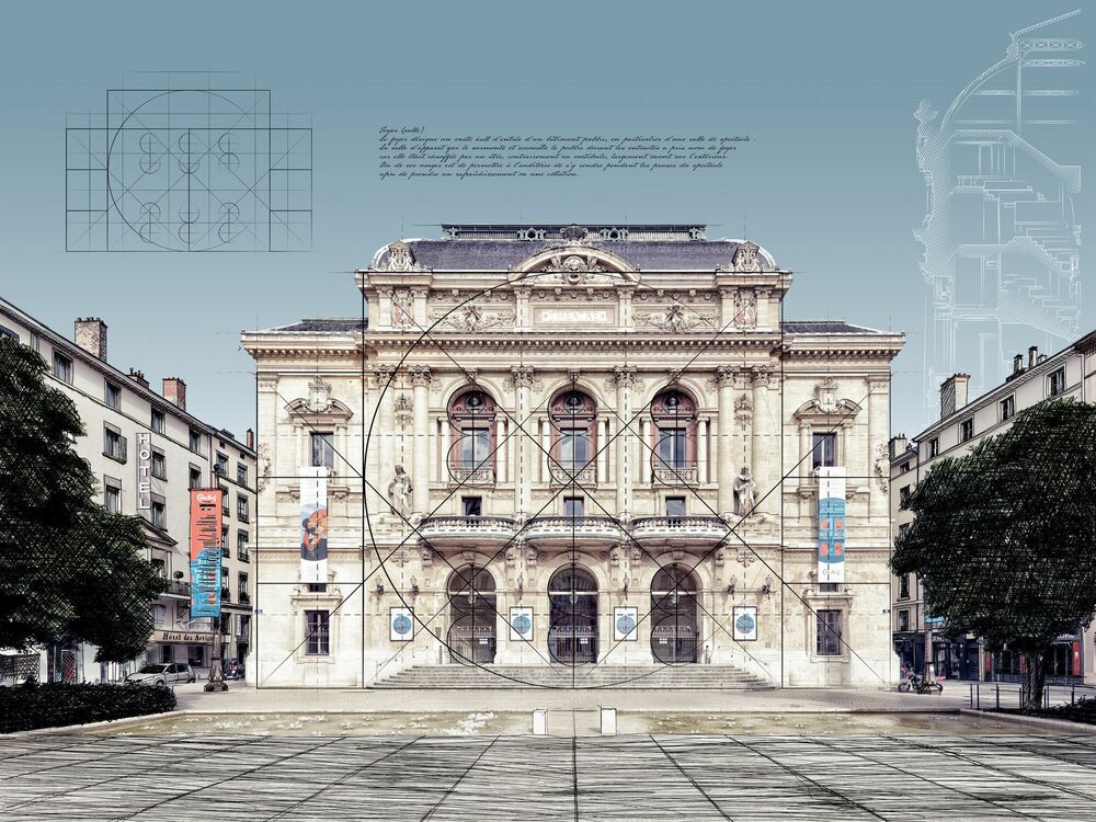
Théâtre des célestins
Napoleon I, who commissioned this monument, initially conceived of this edifice as an entry point towards an avenue connecting the Louvre and Bastille. Today, the Place de l’Etoile serves no fewer than twelve rectilinear avenues.
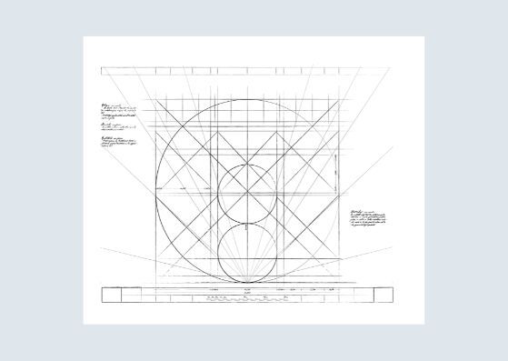
Originally the Théâtre des Célestins was a convent that was transformed into a theatre in 1792. Since its construction in the fifteenth century, the edifice has been struck by misfortune many times, including five fires.
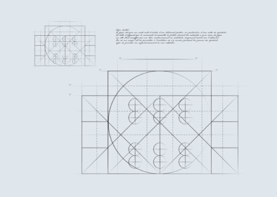
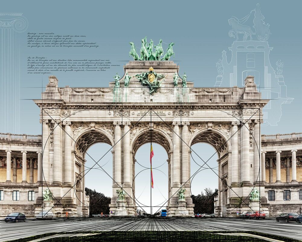
Arcades du Cinquantenaire, Bruxelles
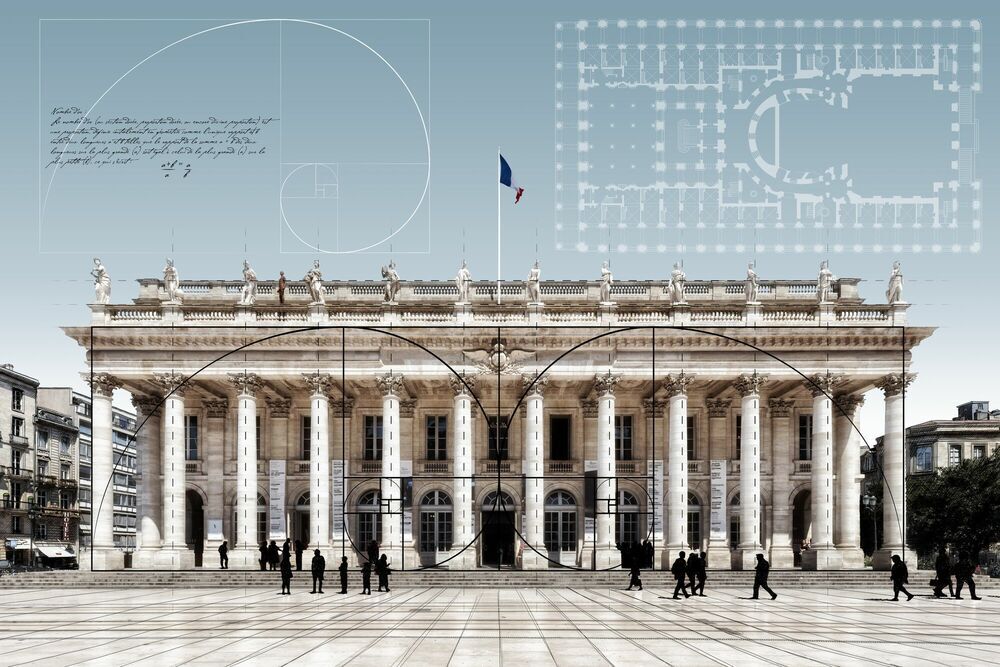
Grand théâtre
Directed by French architect Charles Girault, the Arcades du Cinquantenaire were built in eight months by 450 workers, who relayed each other night and day.
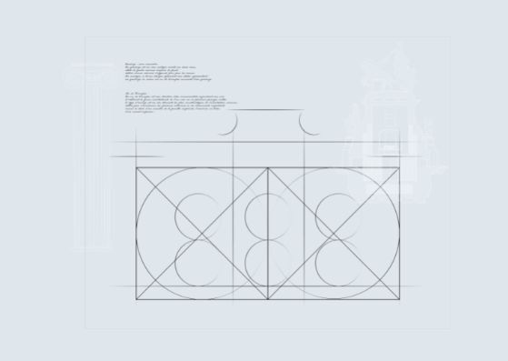
Built by the franc-maçon (freemason) Victor Louis, the Grand Théâtre de Bordeaux was controversial.
Now described as a masterpiece, owing to its proportions aligned to the golden ration, it is the pride of the Bordelese.
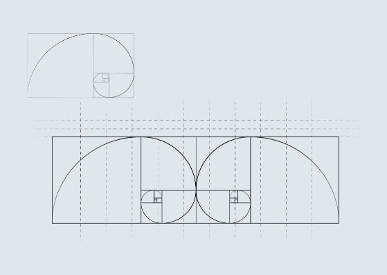
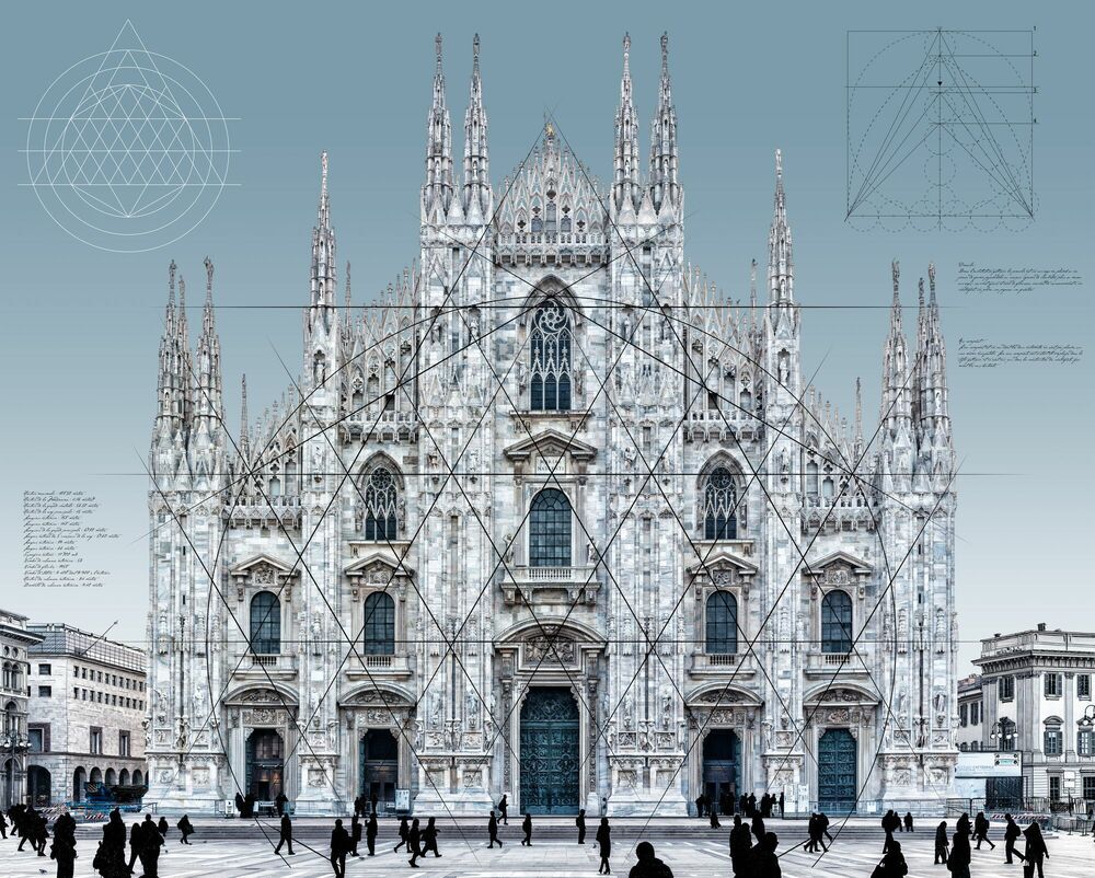
Duomo, Milan
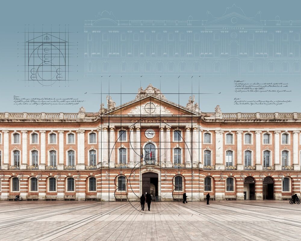
Capitole, Toulouse
When the lord of the city recommenced works in 1387, he opted for an ambitious project. His material of choice was marble from Candoglia and the architectural forms became those of international gothic.
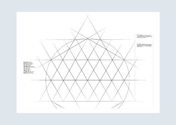
Begun in the seventeenth century, the construction site of the Capitole took nearly two hundred years. Today, its 11,000 square-metre surface is home to the Hôtel de Ville, a tourist office and a dungeon.
Tour Eiffel, Paris
Panthéon
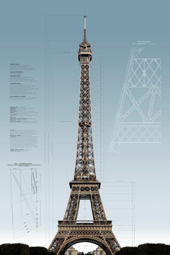
Each winter, the Eiffel Tower shrinks from 4 to 8 cm before returning to its original size in summer. But during intense heat, the expansion of the metal can alter the angle of the Tower. A record of 18 cm was recorded in 1976.
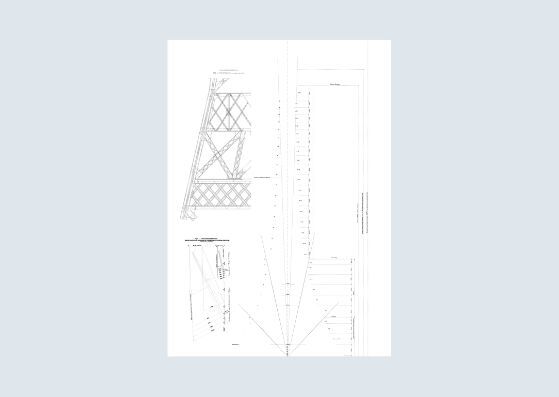
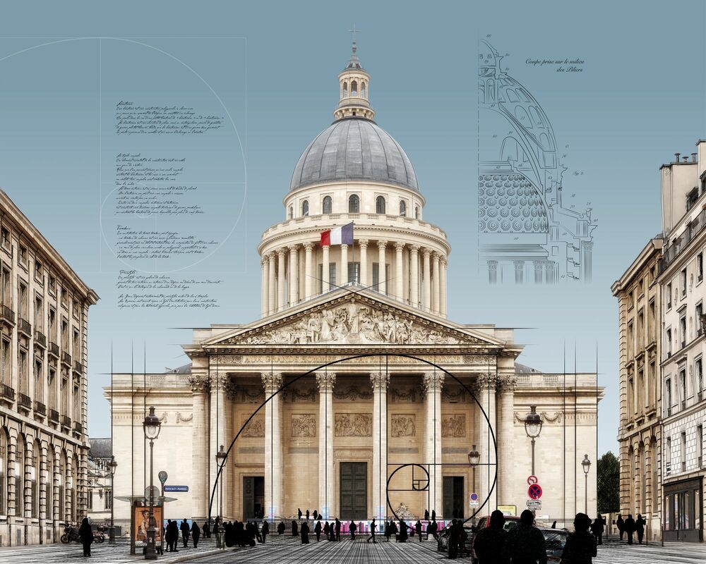
Visible from numerous parts of Paris, the Panthéon’s dome actually conceals three in-built domes:
The interior dome, with chambers and an opening at its centre with an oculus to let in the light;
The intermediary dome, painted and visible through the opening of the interior dome supports the lantern-turret weighing over five tonnes;
The dome, visible from the outside and made of lead-covered stone.
Interview
Where did your inspiration for this new Minimalist series come from?
The main idea was to provide a new interpretation of the most famous, the most photographed of monuments – to see them in new ways. The Minimalist series was inspired by listening to “Recomposed by Max Richter: Vivaldi, the Four Seasons”, which is a reinterpretation of The Four Seasons with a sometimes rather tenuous intervention, as though Max Richter had just wanted to add a bit of modernity to this eighteenth-century work. The idea of transposing this intention to an architectural photography project seemed logical.
Did you design the architectural drawings or are they from historical sources?
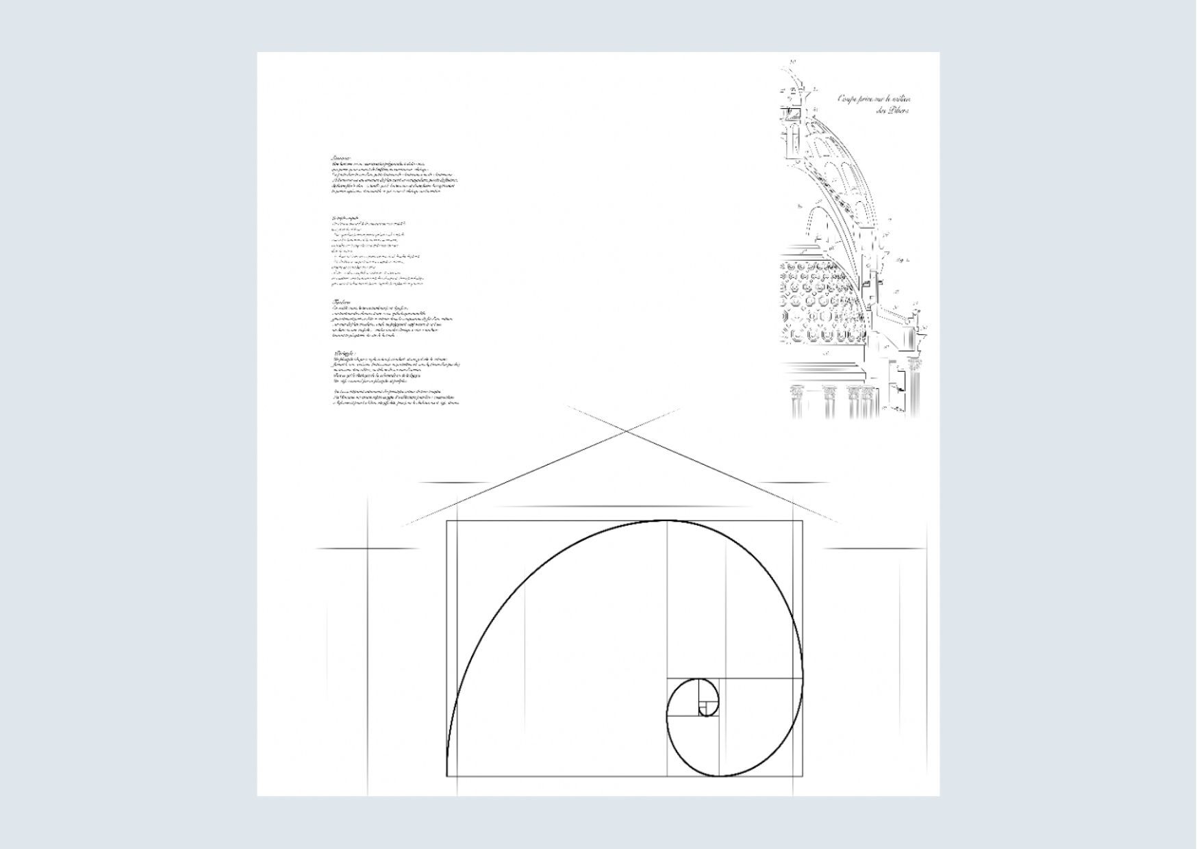
Both: to create this series, I spent most of my time looking for original drawings by architects and designers. I found some of them, sometimes I was lucky enough to find very complete files written by art historians, picking apart each edifice down to the slightest details. However, for others, I did a kind of retroengineering to recover the principles of composition of the façades, which always exist (square, circle, golden ratio, etc.).
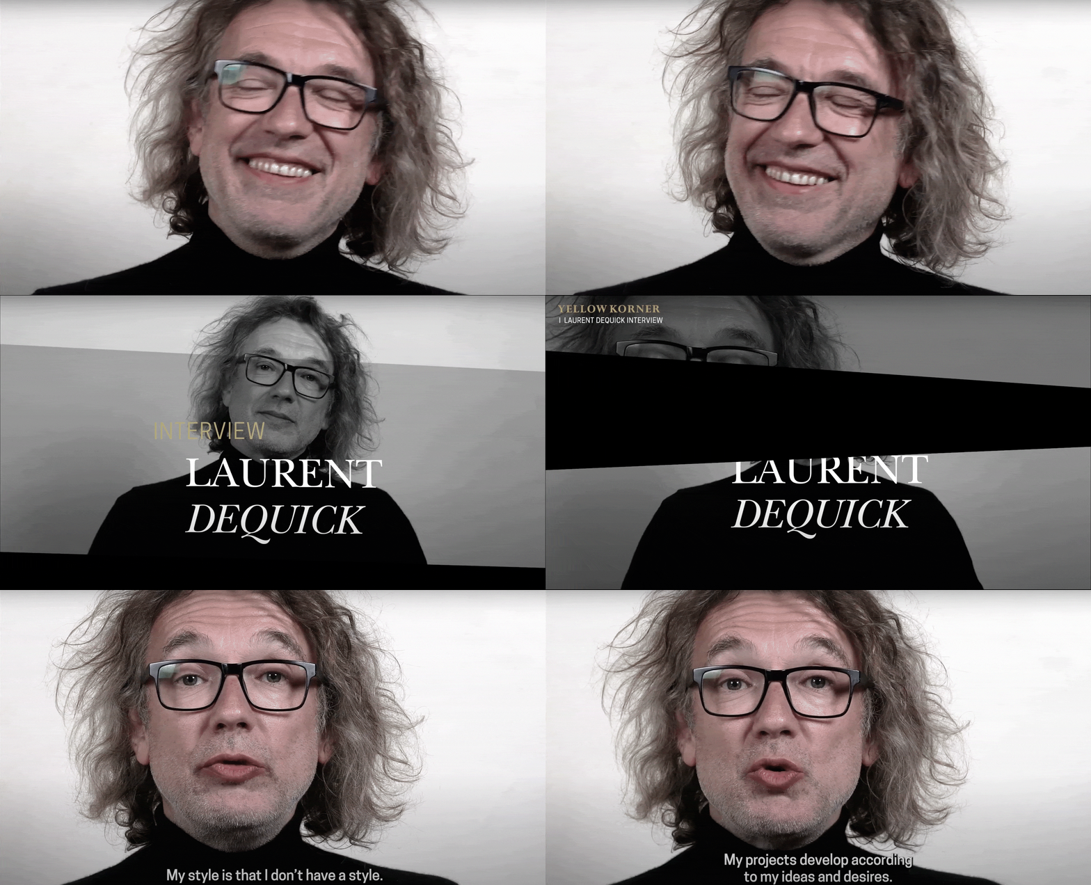
What technique did you use to integrate the drawings within the photo?
Two techniques were available to me. The first, traditional: create drawings by hand directly onto the prints, a bit like Christo does for the preparatory drawings of his artworks. The second, more modern option was to create all of the sketches with the use of a tablet and stylus, through an artistic drawing application. This method gave me a lot of flexibility to distinguish the sketches from the construction lines.
What message would you like to convey with the Minimalist series?
I think that it is always easy to photograph architecture: a building, by definition, doesn’t move. You just need to choose the right moment, the right light. With my Minimalist series, I’d like viewers to learn to see architecture better, so I put in place a certain number of clues to orientate the gaze, to better understand it or at least take an interest in it.
